Summer Hush

Summer Hush is a small collection of watch faces that places airy meadow photography front and center: wide fields of golden grass, soft clouds drifting overhead, and a warm sunset glow that gives each composition a gentle, timeless feel. The images use a palette of warm brown, soft beige, and muted blue so the visuals feel cohesive across every sample. You would choose this collection when you want your Apple Watch to read calm and sophisticated at a glance while still feeling organic and human.
Design inspiration
These faces draw from late-summer pastoral photography and classic landscape painting. The visual language leans into natural textures and soft directional light: seed heads catching backlight, grasses bending in a breeze, and broad cloud shapes where highlights and shadow sit together without harsh contrast. That restrained contrast is deliberate — it lets type sit clearly on the image while keeping the mood peaceful rather than stark.
Layout and readability
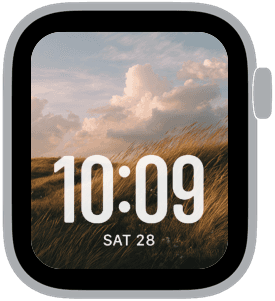
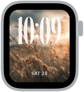
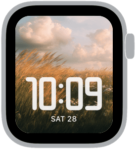
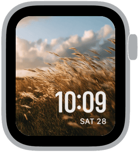
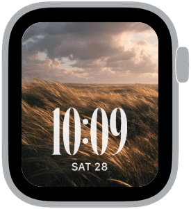
Each Apple Watch sample in Summer Hush was composed with large time as the priority. Times are placed either at the bottom or top depending on the image composition so the numerals never obscure the focal area of the photograph. The large time treatment is balanced against the scene by choosing higher-contrast white or cream numerals when the background grows darker, and subtle, softer color when the foreground is light. This keeps legibility immediate while preserving the atmosphere of the photograph. For days when you prefer a classic serif or a rounded modern face, the collection includes both treatments so you can match the typography to your mood.
Mood and atmosphere
The overall mood is quiet and reflective — the sort of background you’d pick for slow mornings, weekend walks, or moments when you want less visual noise. Sunlit highlights and warm midtones make the faces feel cozy, while muted blue sky notes add cool balance. The result is not flashy; it’s a wearable set for people who like restraint, texture, and a tactile sense of place.
Best use cases
Summer Hush works well for anyone who prefers a minimal, photo-forward Apple Watch experience. It’s ideal for outdoor lovers, weekend commuters, and people who enjoy a single visual theme across devices. Because the imagery keeps a clear area for time display, these faces are great for quick glances during meetings or workouts. The soft color grading also makes complications legible without drawing attention away from the photograph.
Personalization and pairing
Personalize by choosing serif or modern numeric styles to shift the tone from classic to contemporary. Use the bottom time placement for a balanced, centered feel, or top placement when you want the landscape to sit beneath the numerals. Pair Summer Hush faces with darker or neutral watch bands — warm leather and sand-colored nylon work particularly well — and choose complication layouts that favor a single clear readout for a cleaner look.
Technical notes
The images are optimized for clarity on Apple Watch displays and maintain depth in highlights so the clouds and grass keep their texture. Large time styles are tuned to avoid overlap with important photographic details, and all three samples show how the same scene adapts to aesthetic variations in font and placement.
Wrap-up
If you want a refined, photo-driven watch face collection that reads calm and tactile, Summer Hush keeps your Apple Watch looking elegant without fuss. Try a sample, adjust the type style and placement, and let the meadow tones set a quieter pace for your day.
in this collection
Discover all 8 watch faces in our app
download now
you may also like


vellum
time is what you make it