Clementine Sky

Clementine Sky is a small collection of Apple Watch faces built around a dreamy sunset cloudscape: warm orange and pink horizons blending into soft sea-blue sky and lit by a golden hour glow. These samples show how a striking photograph can act as a calm, wearable background while the time remains the primary focus. If you want a watch face that feels like a quiet moment at dusk, this collection gives you that warmth and clarity in three refined layouts.
Design inspiration
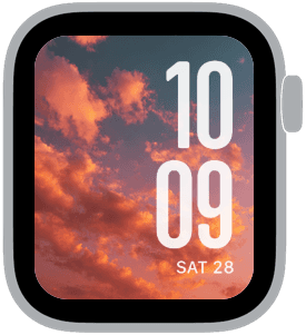
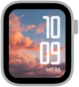
The imagery is inspired by late-summer evenings when the light softens and clouds catch coral tones. Photographic detail is preserved so that your watch face reads like a miniature window to the sky. The three Apple Watch samples demonstrate different typographic voices—modern, classic, and rounded—so you can pair the same sky with the attitude you prefer. The palette leans into orange, pink, peach and muted blue, giving each composition a cohesive, sunlit mood.
Layout and readability
Every sample prioritizes legibility with large, high-contrast numerals placed thoughtfully against brighter or darker parts of the clouds. One layout centers the time in a strong modern font for quick glances. Another uses an elegant, tall classic serif that complements the vertical sweep of cloud formations. The vertical stacked option keeps the time large and right-aligned, ideal if your wrist tilt exposes that side more. Date and complications are subdued—kept small or low-contrast—so they inform without competing with the main time display.
Mood and atmosphere
Clementine Sky feels calm, warm, and slightly nostalgic. The golden-orange highlights evoke a relaxed end-of-day energy, while cooler blue areas balance the palette for a peaceful, sophisticated look. This collection works whether you’re closing out work hours or easing into an evening walk. It reads as premium because of the photo’s soft textures and the careful pairing of fonts with cloud formations.
Best use cases
Use Clementine Sky when you want a watch face that’s visually rich but never distracting. It’s ideal for city commuters who want a refined aesthetic, for weekend leisure when you want a relaxed vibe, or for anyone who enjoys nature-inspired visuals on a daily device. The faces are particularly good for evening wear and social occasions when warm color tones complement outfits.
Personalization tips
Choose the modern, large-time variant if you glance frequently at your watch while on the move. Pick the classic serif for a dressier feel that pairs well with smart-casual attire. The rounded, compact option suits minimalists who want a softer, friendlier look. Adjust complication brightness and placement to keep the photo’s most luminous areas unobstructed. If you prefer mood over function, reduce complication contrast or hide the date for a cleaner image.
Care for the look
Let the photo be the star: avoid too many bright complications or colorful widgets that compete with the sky. Subtle color-matching of complications—light gray or warm cream—will harmonize with the orange and pink highlights. For a slightly bolder effect, use a white, high-contrast time face against the darker cloud bands.
Closing
Clementine Sky offers three refined ways to wear a sunset on your wrist—each one focused on legibility, mood, and a premium photographic finish. Try the different typographic styles to see which complements your routine, then tweak complications for the perfect balance of form and function.
in this collection


Discover all 8 watch faces in our app
download now
you may also like


vellum
time is what you make it