Coastline Fm

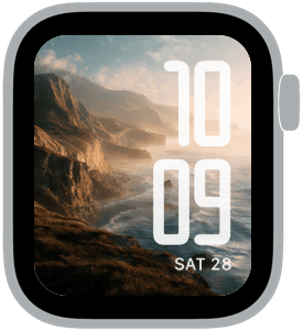
Coastline FM opens with cinematic coastal cliffs, a collection of 16 images that pair dramatic shoreline vistas with refined typographic layouts. These scenes use warm golden-hour light, deep ocean blues, and textured rock faces to create a mood that feels both timeless and quietly cinematic. Designed with Apple Watch in mind, each sample treats the horizon and foreground so the time remains readable without sacrificing the landscape’s atmosphere.
Design inspiration
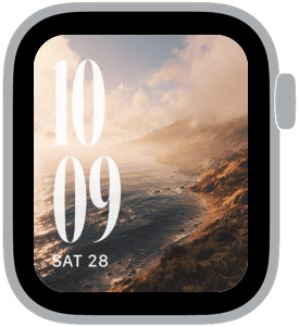
The visuals are inspired by classic coastal photography and cinematic color grading: long shadows, mist rolling off cliffs, and the contrast between sunlit ridges and shadowed coves. Fonts lean modern or classic depending on placement—rounded or tall serif styles appear across samples to match different watch complications and personal tastes. This mix gives you options whether you prefer a bold, contemporary numeral or an elegant, elongated display that echoes vintage signage.
Layout and readability
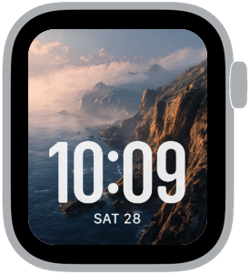
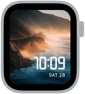
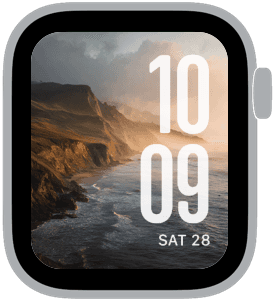
Time is intentionally large and placed for clarity. Some layouts favor centered, bottom-aligned time for unobstructed horizon views; others use oversized left or right columns that become a graphic element integrated with the landscape. Contrast is handled with subtle overlays and careful placement so white or warm-toned numerals remain legible against darker sea and cliff shadows. Small date text is balanced beneath the hour in a compact, unobtrusive style so the numbers are prominent without blocking the most striking parts of the image.
Mood and atmosphere
The overall mood is contemplative and cinematic. Golden-hour warmth creates a sense of late afternoon calm, while deeper blues and seafoam greens undercut with coolness for visual depth. Mist and spray introduce softness at the edges, lending each face a romantic, almost painterly feel. These are not loud, saturated graphics; they are nuanced, texture-rich scenes meant to calm and focus rather than distract.
Best use cases
Coastline FM is ideal for anyone who wants a sophisticated nature backdrop without losing function. If you use your Apple Watch for quick glances and frequent interactions, choose the high-contrast modern numerals placed at the bottom or right. If you enjoy a more editorial look and less frequent checking, the oversized left or center serif layouts add personality and elegance. The variety in fonts and placements makes the collection suitable for formal settings, weekend escapes, and daily wear when you want a subtle reminder of wide open spaces.
Personalization tips
Match font choice to your wardrobe and the mood you want to project: rounded numerals feel casual and friendly, modern condensed types read as minimal and technical, while classic serif displays add a touch of refinement. Use darker images to hide small smudges or reflections on the glass, and choose lighter golden scenes when you want an uplifting, warm appearance. For a cohesive look, pair your Apple Watch strap color with recurring palette notes—deep navy or warm brown leather pairs beautifully with these coastal tones.
Technical notes
Each sample is composed so the most important parts of the scene survive cropping to the Apple Watch display. Time and date placements are tested against the cliffs, sky, and ocean to preserve readability on small screens. If you switch complications often, favor faces where the time sits away from busy textural detail for consistent clarity.
Closing
Coastline FM gives Apple Watch owners a set of cinematic, mood-forward faces that blend grand coastal vistas with thoughtful typographic choices. Pick the layout that suits how you use your watch and let the horizon become a small, calming presence on your wrist.
in this collection
Discover all 8 watch faces in our app
download now
you may also like


vellum
time is what you make it