Sanctuary Amber

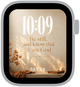
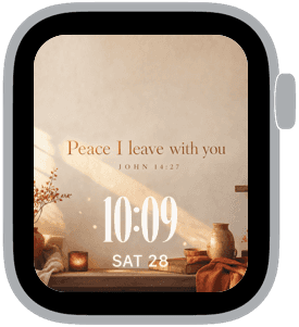
Sanctuary Amber is a collection of three Apple Watch faces that pair soft amber light, textured plaster walls, and simple autumnal accents to create a quietly sacred aesthetic you’ll want on your wrist. Each sample uses warm brown and neutral beige tones, subtle candlelit highlights, and natural shadows to make the time a calm focal point. These designs feel like a small, personal sanctuary—perfect for moments when you want your wrist to nudge you toward stillness rather than distraction.
Design inspiration and visual language
The visual inspiration for Sanctuary Amber comes from quiet interior chapels and sunlit window nooks: plastered walls with a slightly worn texture, a scattering of dried foliage, and low candlelight. Typography leans classic and refined; medium and small time placements are balanced with centered or bottom-aligned scripture and short meditative phrases. The palette is dominated by amber, warm brown, neutral beige, and hints of deep rust, creating an autumnal warmth that reads as intentional and restorative.
Layout and readability
Readability is central to these faces. Time is rendered in medium to large scales with high-contrast white or soft cream numerals so it remains instantly legible against the warm backdrop. Each layout preserves breathing room around the numerals by placing text either above or below the time, never crowded into corners. The classic font choices pair well with the backgrounds’ organic textures and keep the watch face easy to glance at during daily tasks.
Mood and atmosphere
Sanctuary Amber is curated to evoke calm, reverence, and quiet reflection. The soft shadows and candlelit accents produce a meditative mood without feeling gloomy. These faces work as subtle reminders to pause: they aren’t loud or busy, and the colors create a sense of warmth and gentle grounding. The overall feeling is restorative—think slow mornings, evening reflection, or a peaceful commute.
Best use cases
These faces are well suited for anyone seeking a wrist presence that supports mindfulness, prayer, or simply a lower-notification lifestyle. They work especially well in cooler months or autumn when the amber and rust tones feel seasonally appropriate, but the neutral base keeps them wearable year-round. Use them for quiet weekends, meetings where a calm aesthetic matters, or evening routines when you prefer softer, less-stimulating visuals.
Personalization and pairing
Personalization is straightforward: choose between classic or modern numerals, and select top or bottom time placement to suit how you glance at your watch. The classic fonts with medium time make the face feel traditional and formal, while the modern option gives a slightly cleaner, contemporary edge. Pair Sanctuary Amber with a leather or warm brown band to amplify the collection’s comfort; a neutral beige or soft cream band will emphasize the minimalist, serene side.
Practical tips
For best contrast, keep complications minimal or use monochrome complications that don’t compete with the background art. Lower the screen brightness slightly to preserve the soft candlelit feel and avoid overly saturated colors that could undermine the textured plaster look. If you prefer the face to feel more devotional, use calendar or reminders sparingly and let the time and message breathe.
Closing
Sanctuary Amber offers a refined, warm set of Apple Watch faces designed to center and calm. If you want a wrist that feels like a pause button—elegant, simple, and quietly restorative—try these layouts with a leather or neutral strap and see how a softer palette changes the way you check the time.
in this collection



Discover all 8 watch faces in our app
download now
you may also like




vellum
time is what you make it