Vesper Ember

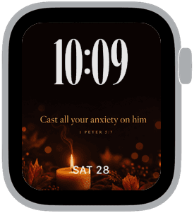
Vesper Ember is a small collection built around warm candlelight, autumnal textures and softly glowing amber tones — a design created for quiet, reflective moments. Each Apple Watch sample uses a dark backdrop to let the golden flame and seasonal accents stand out, with the time placed prominently at the top in medium-sized numerals so it’s instantly readable without competing with the photography.
Design inspiration
The scenes draw on classic evening rituals: a single candle, fallen maple leaves, and bundled wheat arranged against deep black and brown backgrounds. Those elements create a narrative of warmth and solace that reads like a moment captured after sundown. Typography choices alternate between elegant serif captions for the Psalm lines and rounded or modern numerals for the clock, blending old-world reverence with contemporary legibility.
Layout and readability
Time is positioned at the top in a medium size so it’s the first thing your eye finds, while the lower portion houses the date and the scripture caption. The composition deliberately leaves negative space around the top numerals to maintain clarity on smaller screens. Warm highlights and soft bokeh in the imagery provide contrast where needed, ensuring white or off-white time digits are always easy to read against the dark field.
Mood and atmosphere
This collection leans into a contemplative, intimate mood. The amber flame and subtle reflections cast a gentle warmth across the watch face, evoking evening calm and quiet focus. It’s especially suited to moments when you want your wrist to feel like a small, personal anchor — something calming to glance at during a busy day.
Best use cases
Vesper Ember is ideal for anyone seeking a refined, low-key look that still feels expressive. It works well for quiet evenings, church services, meditative breaks, or simply when you want a watch face that reads as both devotional and decorative. Because the visuals are intentionally muted and uncluttered, the faces are also appropriate for professional settings where a subtle yet elegant appearance matters.
Personalization tips
Choose the numeral style that best fits your taste: the classic serif caption paired with rounded numerals offers a timeless feel, while the modern numeral option provides cleaner, slightly more contemporary contrast. Keep complications to a minimum to preserve the photographic foreground; a single date readout at the bottom harmonizes with the composition. If you prefer stronger contrast, use a white or warm-off-white time color; for a softer look, try a pale gold tone that echoes the candlelight.
Technical notes
The photographic elements are optimized for deep blacks and rich midtones, so enabling an always-on display will retain much of the mood while conserving power. Because time is top-aligned, it won’t obscure the central imagery, and the simple layout avoids visual clutter even with medium-sized numerals.
Closing
Vesper Ember is a quietly elegant collection that pairs devotional text with comforting, candlelit photography to create a watch face that feels both personal and composed. If you want a wrist companion that calms and centers you through the day, these designs offer warmth, readability, and refined restraint.
in this collection



Discover all 8 watch faces in our app
download now
you may also like




vellum
time is what you make it