Amber Grace

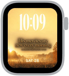
Amber Grace is a warm, devotional collection that bathes your Apple Watch in golden light, autumnal textures, and quiet scripture lines. The palette centers on amber, sunset orange, warm brown and soft gold highlights with a faint film-grain texture and a backlit glow that reads beautifully on every Apple Watch display. You’ll want this set when you’re after a refined, calming face that feels like an evening walk through a field at dusk.
Design inspiration
The photography is inspired by late-afternoon light and harvest landscapes—single trees on rolling hills, close-ups of autumn leaves, and sunlit fields. Those images are paired with elegant typography choices: a classic serif for the scripture lines and a rounded, high-contrast numeral for the medium-sized time at the top. The result is a composition that feels both timeless and modern, like a printed devotional reimagined for your wrist.
Layout and readability
Amber Grace uses top placement for the time to keep it immediately visible without obscuring the horizon in the background image. The medium time size balances presence and restraint so you can glance quickly while still appreciating the scene. Supporting text lines are centered lower on the face with generous line-height and subtle tracking so verses remain legible even at small sizes. Contrast between the warm background and the off-white type is carefully tuned to ensure clarity in bright outdoor conditions and dim indoor light.
Mood and atmosphere
This collection evokes calm, gratitude, and quiet reflection. The amber and gold tones produce a comforting warmth, while the soft grain and light flecks create a sense of gentle motion—the kind you notice when sunlight catches dust motes in the air. These faces are ideal for moments when you want your watch to feel like a small pause: a reminder to breathe, reflect, or give thanks.
Best use cases
Amber Grace is suited to everyday wear for anyone who prefers understated elegance with a spiritual or contemplative bent. It works particularly well during fall and late summer when those amber tones echo the season, but the warm palette is versatile enough year-round. Use it for morning routines, quiet weekends, church services, or any time you want a touch of calm. The top-time placement also makes it practical for quick glances during meetings or while commuting.
Personalization and tips
Choose the face variant that matches your reading preference: the samples show different verse placements and image crops—one focused on leaf detail, another on a field, and a third centered on a lone tree. If you want the verse to be prominent, pick the layout with slightly larger serif text; if you prefer a cleaner look, select the version with reduced scripture opacity so the landscape takes center stage. Adjust complications sparingly; a single small complication below the time or a date readout at the bottom keeps the aesthetic uncluttered.
Material and finish considerations
On OLED Apple Watch models the deep amber shadows feel rich and immersive; on LCD models the softly diffused highlights maintain warmth without appearing flat. The collection’s subtle texture preserves photographic detail but never competes with the type, so both image and information coexist harmoniously.
Closing
Amber Grace gives your Apple Watch a refined, contemplative look that balances readable, top-centered time with soulful imagery and comforting color. Try a variant that matches your mood and let the warm glow become a daily reminder of calm and gratitude.
in this collection


Discover all 8 watch faces in our app
download now
you may also like




vellum
time is what you make it