Neon Tide

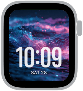
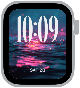
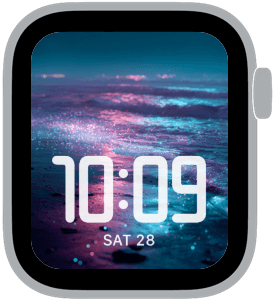
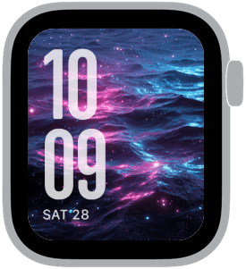
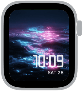
Neon Tide opens with saturated, neon-lit ocean imagery: shimmering waves in electric blue and magenta, flecks of glowing light, and a soft bokeh that turns every glance into a little moment of cinematic color. This collection pairs dramatic, fluid textures with large, readable time typography so your Apple Watch is striking without sacrificing clarity. You’ll want these faces when you’re after a nightlife-ready aesthetic, a splash of color for long commutes, or a striking backdrop that still makes the time the star.
Design inspiration and mood
Neon Tide draws on retro-futuristic club lighting and the organic movement of water. The imagery feels both natural and synthetic — oceanic motion rendered with neon highlights and iridescent flecks that catch the eye. The palette—deep midnight blues, electric cyan, and hot magenta—creates a sense of depth and motion, while scattered sparkles give the scenes a playful, bioluminescent quality. The overall mood is cinematic, slightly dreamy, and confidently modern.
Layout, readability, and font choices
Each Apple Watch sample in this series uses large, high-contrast numerals placed to work cleanly against the busy backgrounds. The faces favor bold modern fonts and classic serif options depending on the design, with tested placements at top, bottom, left, and center so the time remains immediately legible. The collection includes examples with extra-large time for quick checks and smaller, elegant time styles for a refined look. Designers tuned contrast and spacing so the digits remain readable over shifting highlights and particles.
Best use cases
Choose Neon Tide when you want a watch face that’s equal parts style and function: nights out, creative work sessions, city travel, or moments when you want your device to feel like an intentional accessory. The bold colors also make these faces useful in low-light conditions where a neutral face might disappear. For workouts or active use, pick the layouts with larger numerals and clear separation between time and complications. For everyday wear, the more balanced compositions let the imagery breathe while still keeping information accessible.
Personalization and styling tips
Match strap material and color to the palette: black or midnight blue bands underscore the neon drama, while white or soft gray straps provide contrast and a lighter touch. If you prefer minimal distraction, select the simpler faces with bottom-placed time and no extra complications. If you like personality, pick a serif or rounded font option to soften the look. Consider pairing Neon Tide with a watch face complication that uses flat white or light cyan icons so they remain distinct over the iridescent textures.
Technical notes and compatibility
These faces are optimized for the latest Apple Watch display sizes used in current models, scaled to keep numerals crisp over detailed imagery. Designers balanced glow and contrast so the time is readable in both Always-On and full-bright modes. The collection’s variations provide options for users who want a statement face and those who need uncompromised legibility.
Closing and call to action
Neon Tide is for anyone who wants their Apple Watch to feel like a wearable piece of art—luminous, dynamic, and unmistakably modern. Try the different font placements and time sizes to find the balance that fits your day, then save your favorite for a vivid, everyday statement on your wrist.
in this collection
Discover all 8 watch faces in our app
download now
you may also like


vellum
time is what you make it