Still Waters

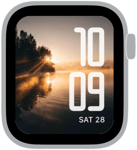
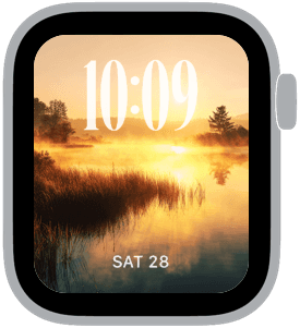
Still Waters is a curated set of Apple Watch faces built around quiet lake sunrises, soft mist, and warm golden light — perfect when you want your watch to feel calm and composed. These samples use large, high-contrast numerals placed deliberately at the top, bottom, or right edge so the time reads instantly over reflections and hazy treelines. The palette leans toward soft amber, warm brown, and muted green with low-contrast sky tones that keep the visuals atmospheric without obscuring complications.
Design inspiration
These faces are inspired by early-morning landscapes where light skims the water and mist blurs edges. Photographic composition leans on horizontal reflections and vertical tree silhouettes, creating natural anchors for typographic placement. Classic and rounded fonts are paired with the imagery to balance nostalgia and modern clarity; one layout favors a large, elegant serif for a dressier look, while others use modern and rounded sans serifs for a minimalist, contemporary feel.
Layout and readability
Watch readability guided every choice. Time displays are oversized and kept in high-contrast white to stay legible over darker bands of the photo. Top placement works well against open sky zones, bottom placement pairs with calmer water reflections, and right-aligned stacked numerals use vertical negative space beside trees. Each sample leaves breathing room for the date and small complications so the face feels uncluttered and functional.
Mood and atmosphere
The overall mood is tranquil and meditative. Golden hour tones and misty gradients make these faces feel like a gentle pause each time you raise your wrist. They work especially well for mornings, commutes, or quiet evenings when you want technology to feel more like a thoughtful companion than a distraction.
Best use cases
Choose the serif, top-time variant for moments when you want a refined, statement look that pairs well with formal attire. The modern bottom-time options are ideal for daily wear and active mornings because the large numerals remain clear at a glance. The rounded, right-aligned design is excellent for those who prefer a bold, graphic time display that complements casual and creative outfits. Across all samples, the soft colorway keeps complications legible without fighting the image.
Personalization tips
Adjust complication choices to complement the image: pick minimal data (date and battery) to preserve the photograph or add weather and activity rings for utility. Use darker or lighter watch bands to echo the warm brown or muted green tones in the photos. If you prefer a cleaner look, switch to monochrome complications so the face reads as an evocative background with a crisp time readout.
Technical considerations
The imagery is optimized for contrast where the time sits; however, if you find certain moments of the photo interfere with legibility, toggle the time style to a filled background option or reduce background brightness in watch settings. These faces are designed to be friendly on battery while still delivering a rich visual experience.
Finish and call to action
Still Waters is for anyone who values calm mornings and elegant utility. Try each placement and font to find the version that fits your daily rhythm, then set it as your primary face to carry that same quiet light through your day.
in this collection


Discover all 8 watch faces in our app
download now
you may also like


vellum
time is what you make it