Harvest Table
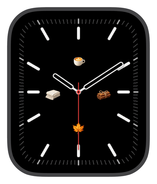
Harvest Table is a seasonal collection of small, stylized icons arranged like place-settings on a simple dial—warm orange, golden brown, cream, and rust tones combine with tactile textures so your Apple Watch feels like a cozy autumn moment at a glance. These four samples present food and harvest motifs—apples and pears, pies and croissants, maple leaves and acorns, jars of honey and syrup—composed to read clearly on the compact screen while keeping a handcrafted, tabletop charm.
Design inspiration
The imagery is drawn from classic harvest visuals: market fruit, baked goods, spice bundles, and foraged finds. Each icon is rendered with subtle shading and a slight shine so they read as miniature objects rather than flat emojis. The choice of colors—warm orange, muted gold, rust brown, and neutral cream—echoes late-afternoon light and weathered kitchen surfaces, giving the faces an intentionally tactile, seasonal sensibility.
Layout and readability
These samples were composed for clarity on circular and rounded-square dials. Icons are placed at cardinal points so the hands remain unobstructed and the time is always legible. The backgrounds are deliberately dark and minimal to increase contrast; that makes the small, colorful motifs pop without requiring heavy overlays or busy textures. For quick glances, choose a larger numeral or bold type option so the time stands out against the decorative icons. When you prefer a quieter look, lighter complications and thin type preserve the objects as the visual focus while keeping numerals unobtrusive.
Mood and atmosphere
Harvest Table reads as warm, calm, and slightly nostalgic. The collection leans into the comforting rituals of the season—morning coffee, fresh-baked bread, sticky-sweet preserves—and translates those feelings into an intimate wrist detail. It’s not playful or loud; instead, it aims for a refined, homey vibe that complements autumn outfits, wool bands, and leather straps.
Best use cases
These faces are ideal for weekend mornings, farmer’s market runs, holiday meal prep, and any time you want a seasonal accent without a full photographic scene. The icons pair naturally with neutral or textured watch bands and are well suited to casual workdays, brunches, and outdoor fall activities. If you spend time in kitchens, cafés, or craft markets, the imagery feels appropriate and immediate.
Personalization tips
Switch between type styles to shift the face from decorative to more utilitarian. Use top placement for faster glances during active moments and bottom placement if you want the icons to feel like a focal vignette. Lighter complication colors keep the palette airy with cream and gold motifs; darker complications preserve contrast when you prefer richer rust and brown tones. Small changes to font weight, complication set, or hand style will change the overall presence without sacrificing the seasonal identity.
Final note
Harvest Table is a compact celebration of fall—carefully scaled icons, a cozy color palette, and thoughtful layout decisions that keep the time readable and the look tasteful. Swap among the four samples to match your mood and let the small details bring a quiet, harvest-time warmth to your wrist.
in this collection


Discover all 4 watch faces in our app
download now
you may also like




vellum
time is what you make it