Team Korea

Team Korea is a curated set of Apple Watch faces that translate Seoul’s skyline into a cool, modern visual story. The palette centers on steel and seafoam blues with soft grain and reflective water textures, creating a calm, slightly moody atmosphere. You’ll want these faces if you prefer restrained city imagery, bold legibility, and a contemporary aesthetic that reads clearly at a glance on Apple Watch.
Design inspiration
The collection draws from contemporary Korean architecture and waterfront perspectives — tall towers, mirrored surfaces, and layered city silhouettes. Each sample simplifies complex detail into striking shapes so the skyline reads clearly even at a small scale. The mood is metropolitan and refined, mixing photographic realism with subtle illustrative texture to feel both familiar and stylized.
Layout and readability
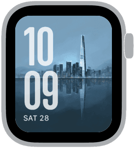
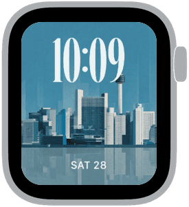
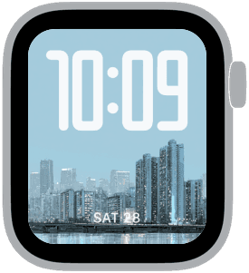
Time treatments vary across samples to suit different preferences: extra-large modern numerals placed left for instant reading, classic serif styles centered at the top for a dressier look, and rounded, friendly digits for a softer tone. Each layout balances the cityscape so the hours remain the focal point without losing the backdrop’s character. Contrast is tuned for legibility against mist and shadow, and negative space is used intentionally to avoid clutter on smaller screens.
Mood and use cases
These faces work particularly well for daily wearers who commute through the city, fans of minimalist architecture, or anyone who likes a subdued, contemplative home screen. The cool blue hues and evening-light textures create a calming presence that pairs nicely with neutral bands and understated outfits. They are equally suited for daytime use when you want a cleaner, less distracting face and for late evenings when the reflective tones feel atmospheric.
Personalization tips
Choose the left-placed, extra-large time if you need a clear, quick-read display when you’re on the move. The classic-font, top-placed variant adds a touch of formality for meetings or events. Rounded numerals soften the overall feel and pair well with watch complications that show simple data like battery and date. Consider matching a blue or gray watch band to emphasize the palette, or a leather strap to introduce warmth against the cool city tones.
Finishing details
Each asset in Team Korea maintains subtle grain and texture so the image doesn’t look flat under different brightness settings. Reflection and shadow are preserved but muted, so complications and date indicators remain readable. The collection includes three Apple Watch samples that showcase how the same skyline can shift from modern and bold to classic and elegant depending on typography and placement.
Try it on
Apply Team Korea to your Apple Watch and check each time style in different lighting. Swap typography and placement until you find the balance between aesthetic and function that fits your day. These faces are designed to be wearable, useful, and quietly metropolitan — a daily reminder of urban calm on your wrist.
in this collection


Discover all 6 watch faces in our app
download now
you may also like


vellum
time is what you make it