Strawberry Fields
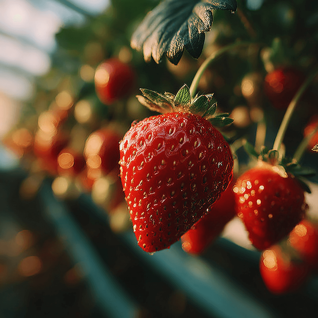
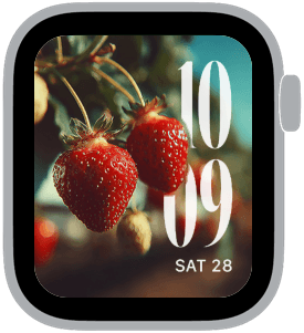
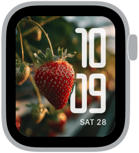
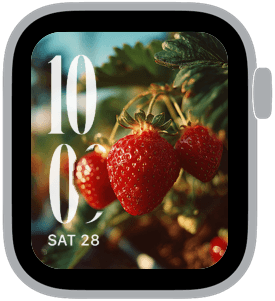
Strawberry Fields is a sun-drenched Apple Watch collection that pairs close-up, photoreal strawberries with oversized, X-Large time typography and deliberate left or right placements. The palette is dominated by ripe red and leafy green, warmed by golden brown highlights and soft bokeh. You’ll want this set because it turns a daily glance at the time into a small moment of brightness — vivid fruit, tactile depth, and clean, readable numerals make each glance feel fresh.
Design inspiration and visual intent
The imagery in Strawberry Fields is inspired by backyard gardens and farmer’s market produce photography: tight, unposed fruit in natural light, shallow depth of field, and a slightly dewy sheen on the strawberries. Composition emphasizes one or two berries in the immediate foreground while leaves and stems recede into a pleasantly blurred background. That sense of depth is reinforced by the 3D foreground treatment used across each sample, which gives the fruit a tactile quality that pairs beautifully with large typographic time displays.
Layout and readability
Each Apple Watch sample balances dramatic imagery with high-contrast numerals sized for ultra-quick reading. The collection offers left and right time placements to match wrist preference: left-aligned times sit flush against the fruit when the composition favors a right-side stem, and right-aligned times are used where the focus sits left. A modern condensed font appears in several variations for a bold, contemporary look; classic and rounded options are available for a warmer, softer tone. Despite the strong visuals, legibility remains the priority thanks to generous scale, clean letterforms, and careful placement that avoids busy highlights and deep shadows behind the numbers.
Mood and atmosphere
Strawberry Fields feels bright, optimistic, and slightly nostalgic — the kind of imagery that evokes summer mornings and quiet garden moments. Warm highlights and natural shadows create a calm, tactile mood rather than a polished studio sheen. The overall effect is lively without being loud: color-saturated strawberries pop against deep greens and warm brown bokeh, giving a rich, appetizing presence at a glance.
Best use cases
This collection is ideal for anyone who wants a cheerful yet refined look on their Apple Watch. It complements casual and weekend outfits, summertime wardrobes, and anyone who enjoys botanical or food photography. The bold numerals make it a great choice for active users who need clear time reading while walking, cycling, or cooking. The variety of font feels and time placements means you can pick a variant that reads more modern, more classic, or more playful depending on your daily style.
Personalization and pairing
Personalize Strawberry Fields by choosing the time placement and font that matches your wrist and taste. If you prefer minimal wrist clutter, opt for the clean, condensed type with the background slightly muted; for personality, pick the rounded or classic face with a stronger bokeh. Pair the watch face with a leather strap in warm brown to echo the highlights, or a green textile band to complement the leaves for a coordinated look. For complications, keep them minimal and high-contrast so the primary visual — the strawberry — remains the focal point.
How to make it yours
Open the collection and preview each sample while rotating your wrist to check how the numbers interact with the fruit. Try left and right placements to see which keeps the time clear over the brightest parts of the image. Adjust complication brightness and size sparingly to preserve the 3D foreground depth. The result is a watch face that feels personal, fresh, and unmistakably seasonal — a small everyday indulgence that lifts your wrist view.
Ready to brighten your wrist? Choose your favorite Strawberry Fields sample, set the placement that suits your wrist, and let a splash of summer color greet you every time you check the time.
in this collection

Discover all 4 watch faces in our app
download now
you may also like


vellum
time is what you make it