Still Words
Still Words is a curated Apple Watch collection that pairs short, mindful phrases with a warm, neutral backdrop of beige and cream sunlight filtered through sheer curtains. The look is intentionally minimal: soft shadows and subtle plant silhouettes create a living-room warmth while the typography anchors the screen—classic serif lines for the message and contemporary rounded or modern numerals for the time. You’ll want this set when you want your watch to feel like a quiet pause rather than a loud notification.
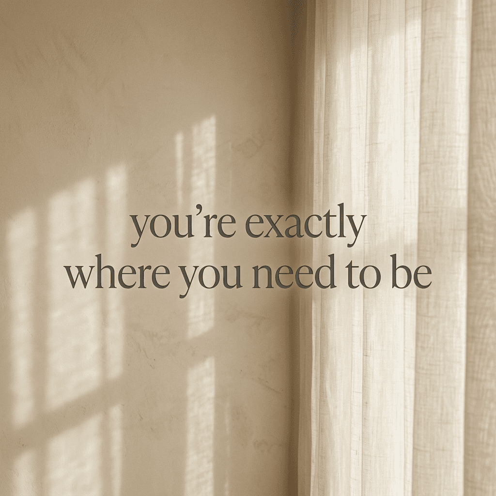
Design inspiration
The collection draws from interiors with natural light, linen drapes and muted greenery. It borrows typographic contrasts from editorial layouts: a refined serif for the sentiment and a geometric or rounded numeral for clarity. This contrast makes each quote feel like a small headline without competing with the time display. The visual language celebrates restraint—few colors, soft gradients, and real-world textures—to keep attention on what matters: the moment and the message.
Layout and readability
Each sample places the time in a consistent, prominent spot—top or bottom depending on the layout—paired with medium or small time sizes so the text remains legible without overpowering the quote. The quotes are centered or slightly elevated to align with natural eye movement when glancing at your wrist. Typeface choices balance readability with character: the time uses a clean rounded or modern font for quick recognition, and the message uses a classic serif with generous letterspacing so phrases remain readable at a glance and feel calming up close.
Mood and emotional effect
Still Words aims for a tranquil, grounding mood. The beige and cream palette, soft green accents from plant silhouettes, and warm shadows evoke early morning or late-afternoon light—moments when people naturally slow down. The quotes are concise and affirmative, written to reduce friction and invite reflection. Wearing one of these faces transforms the watch into a subtle companion that nudges you toward composure rather than distraction.
Best use cases
This collection works best for people who prefer a calm, introspective aesthetic and a watch face that doubles as a wearable reminder. It’s ideal for slow mornings, meditation breaks, work-from-home setups, or evenings when you want to reduce screen anxiety. The restrained palette makes these faces versatile against both casual and business attire, and the soft textures photograph well in low light if you capture them for sharing.
Personalization tips
Adjust the time size and placement to suit your glance style: choose top placement with medium numerals if you prefer immediate time checks, or bottom placement with smaller numerals if you want the quote to take center stage. Swap between serif and rounded numeral styles depending on whether you want a more classic or contemporary feel. If your watch allows color tweaks, nudge text tones slightly warmer for a cozier look or cooler for a more neutral, editorial appearance.
Practical notes
Eight assets offer subtle variations in curtain folds, shadow angles, and text placement so you can rotate faces across the day. The typographic hierarchy is optimized to keep important information visible during quick glances while retaining a polished composition for longer looks. Each face is designed to minimize clutter; complications are kept to a minimum so the message remains unobstructed.
Closing
If you want a watch face that feels like a brief, elegant reminder to breathe and stay present, Still Words brings a timeless, sunlit aesthetic to your wrist. Try a few variations to find the balance of time prominence and quote focus that fits your day, and let these gentle phrases shift the tone of small moments.
in this collection


Discover all 8 watch faces in our app
download now
you may also like


vellum
time is what you make it