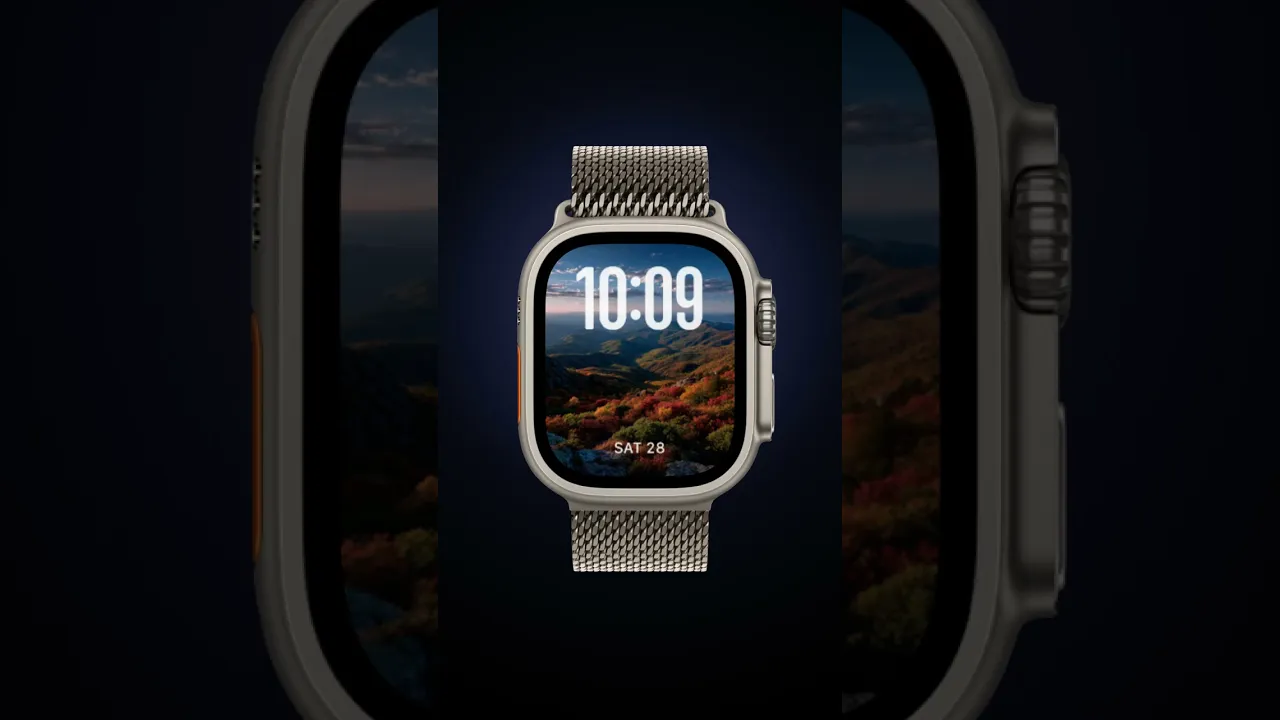
Scarlet Mile
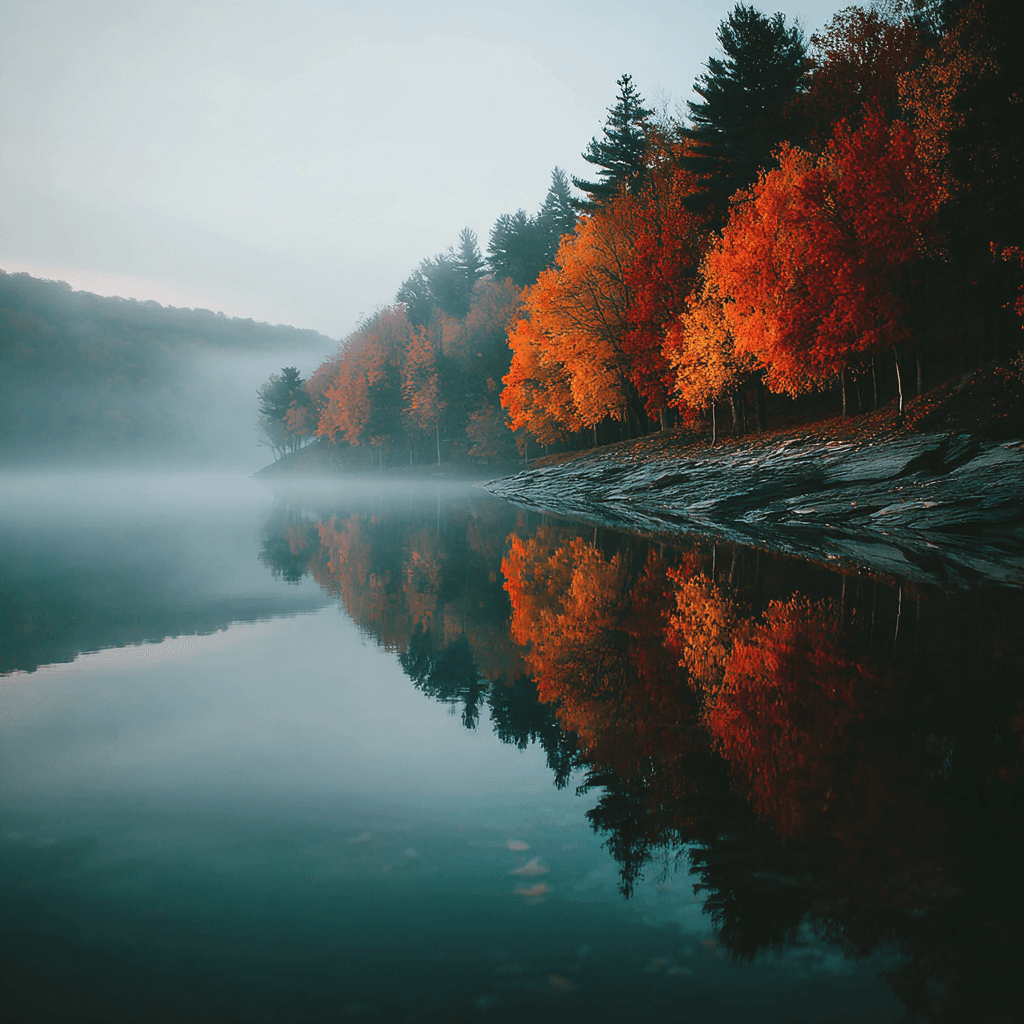
Scarlet Mile showcases a collection of moody autumn landscapes rendered in deep scarlet, rust orange, warm brown, and golden hour light. These images pair misty lakes, winding dirt roads, and rolling ridgelines to create a cohesive visual story that feels both nostalgic and refined. You’ll want this collection if you enjoy bold seasonal color that still reads clearly at a glance on your wrist.
Design inspiration
The direction for Scarlet Mile draws on classic fall panoramas—fog lifting off a still pond, a country lane bending beneath old maples, and a hilltop view of layered ridges. Photographic composition emphasizes strong foreground foliage and distant horizons so the scene reads at small scale while preserving texture and depth. The palette leans on saturated reds and oranges with muted neutrals to keep the overall look elegant rather than garish.
Layout and readability
Each sample is cropped and composed for Apple Watch screens with large time treatments and clear bottom placement in mind. The images are selected so the darkest and most detailed areas frame rather than compete with time text. Contrast between the numerals and the background is prioritized; lighter sky areas and softened fog make the numbers pop, while denser tree canopies are positioned away from the type to avoid visual clutter. Where the background is busy, the time uses a classic, high-contrast font to ensure instant legibility.
Mood and atmosphere
Scarlet Mile aims for a calm, reflective mood—think quiet early mornings and slow evening drives. The collection feels quietly luxurious, pairing dramatic autumn color with restrained composition. Fog and soft light add a contemplative layer that suits both active days and slower moments. The overall effect is warm and grounding, ideal when you want your watch to feel like a small window into a peaceful landscape.
Best use cases
These faces are perfect for people who prefer large, easy-to-read time displays without sacrificing visual interest. They work well for outdoor enthusiasts, commuters who want a seasonal touch, and anyone who favors a classic aesthetic with modern clarity. The bottom-placed time treatments keep complications and notifications unobstructed, while the imagery provides subtle variety throughout the week.
Personalization tips
Choose a large or x-large time style if you want instant legibility on the move; a rounded or modern font softens the composition for a more casual feel, while a classic serif adds a dressier touch. For darker environments pick samples with lighter skies to maintain contrast; when you want moodier visuals, select the denser foliage scenes. Consider pairing these faces with strap materials in warm brown leather or deep burgundy to echo the palette.
Technical notes
Images were cropped and balanced so the focal leaves and horizon lines fall outside the time zone, ensuring the date and numerals remain unobstructed. Colors are tuned to preserve the natural warmth of autumn while avoiding oversaturation that can flatten detail. Each asset scales cleanly across the Apple Watch display sizes used in the samples.
Closing
Scarlet Mile is a refined seasonal suite for your Apple Watch that combines bold fall color with practical legibility. Swap a face to match the day—foggy pond for calm mornings, winding road for errands, or hilltop vista when you need a brief, scenic lift—and let the warm palette carry you through the season.
in this collection


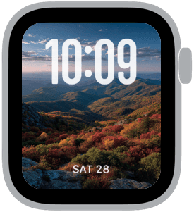


Discover all 8 watch faces in our app
download now
you may also like


vellum
time is what you make it