Liquid Chrome Pastels
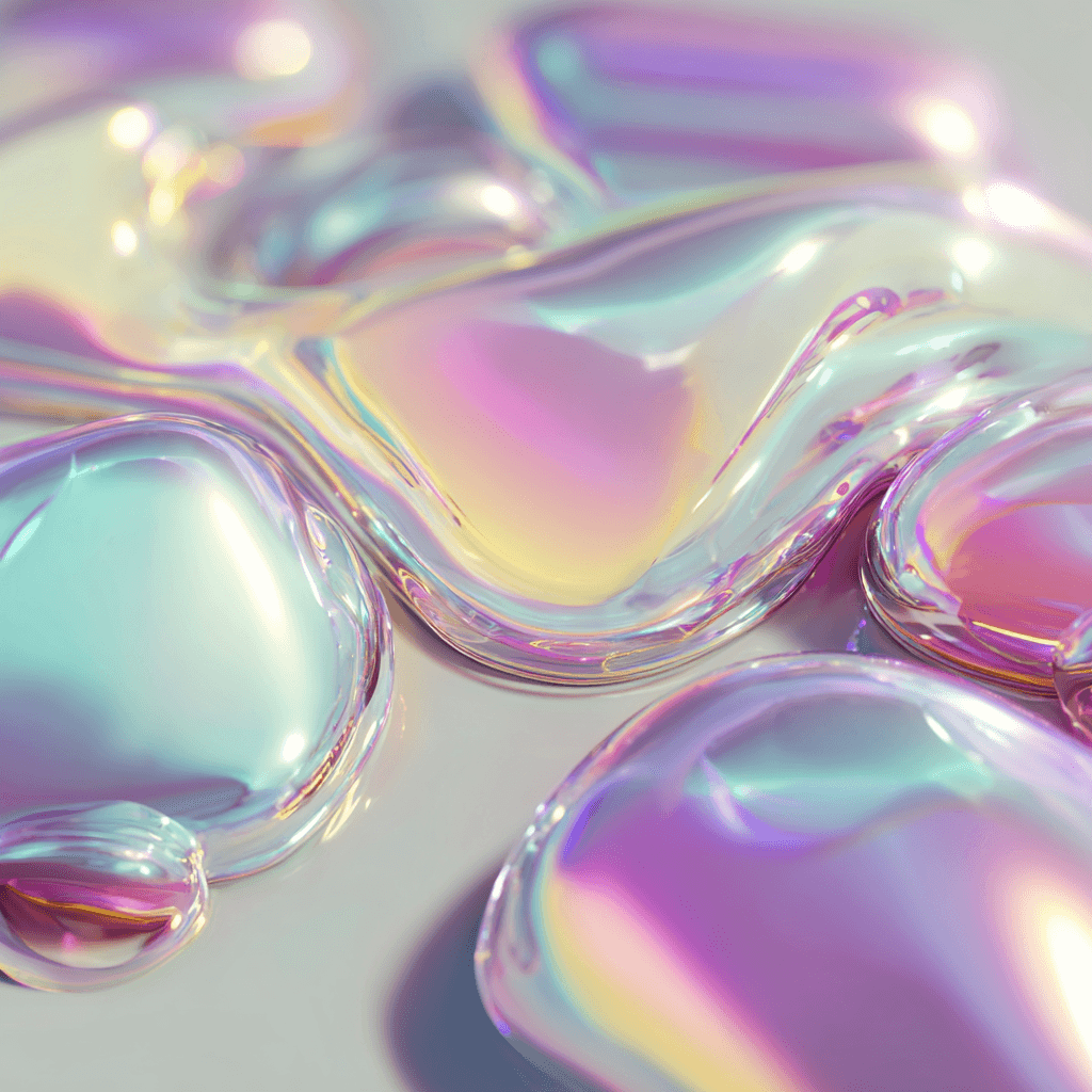
Liquid Chrome Pastels is a curated set of glossy, iridescent faces that look like liquid metal caught in soft pastel light. These designs combine pearlized chrome reflections, lavender and mint highlights, and smooth, organic droplets to create a tactile, luxurious surface on your Apple Watch. The palette favors soft pinks, warm peach, cool mint and muted lilac with metallic rims that catch the ambient light, so each glance feels like a tiny moment of sparkle.
Design inspiration
The collection draws from jewelry-grade finishes, soap-film iridescence, and contemporary sculpture. Each sample reads like a close-up photograph of melted chrome pigments, with flowing forms and subtle micro-textures. The result nods to both high-fashion accessories and minimalist product photography, balancing ornate surface detail with uncluttered negative space so the time remains legible.
Layout and readability
These faces are composed to keep the time clear against reflective backgrounds. Samples show several typography treatments: a modern small-time option at the bottom, a classic large serif at the top, and a rounded, X-large left-aligned layout for quick glances. Contrast is achieved through bright, mostly white numerals and gentle shadowing that separates digits from specular highlights. The composition favors central and lower placements where chrome droplets create calm areas for the numbers, ensuring quick readability while preserving the artwork’s flow.
Mood and atmosphere
Liquid Chrome Pastels feels both playful and serene. The iridescent shimmer gives a joyful, luminous mood without being loud; colors stay soft and sophisticated rather than neon. The metallic finish adds a tactile quality that can make everyday interactions feel elevated, turning routine time checks into a small visual pleasure. Wearers often choose these faces when they want a subtle statement piece that reads as modern jewelry on the wrist.
Best use cases
These faces work well for casual and creative settings, evenings out, or whenever you want your Apple Watch to act like an accessory. The serene pastel tones pair especially well with neutral or soft-hued outfits and jewelry in rose gold or white metal. Because the designs preserve strong numeral contrast, they’re suitable for quick glances during meetings, commuting, or workouts where rapid time reads matter.
Personalization tips
Choose the typography and placement that matches your daily habits: small bottom time if you prefer compact numerals, large top serif for a more editorial look, or rounded left-aligned numerals for oversized legibility. Adjust complication visibility to keep the chrome art visible; minimal complications or a single date readout maintain the aesthetic best. If your band is metal or soft leather, pick cooler mint or lavender faces; warm peach and soft pink variations pair beautifully with rose gold hardware.
Final note
Liquid Chrome Pastels offers a refined, glossy take on iridescent color—perfect for anyone who wants their Apple Watch to feel like a small piece of wearable art. Switch between the three Apple Watch samples to find the font and placement that suits your rhythm, and let the pearlescent surfaces do the styling for you.
in this collection


Discover all 8 watch faces in our app
download now
you may also like


vellum
time is what you make it