L Train Motion

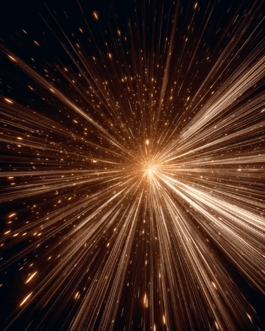
L Train Motion is a collection of kinetic urban frames that feel like a late-night commute frozen in motion: streaked headlights, polished stainless cars, teal shadows and warm amber tails. These compositions use motion blur and long-exposure energy to create depth and movement while keeping time legible and stylish on Apple Watch.
Design inspiration
These pieces draw from nocturnal city travel photography—subway platforms, passing trains and tunnel light trails. The palette mixes cool cyan gradients with saturated orange and red highlights, and the metal textures add a tactile sheen that reads well at small sizes. That contrast between cold and warm tones is deliberate: it preserves detail in shadows while letting signal lights pop.
Layout and readability
Each Apple Watch sample was composed with clarity in mind. Time treatments range from classic serif X-Large numerals to modern rounded digits in bottom and right placements, chosen to avoid visual collision with the brightest streaks. Left-placed large type works with darker negative space; bottom placements sit above platform textures to keep numbers readable without obscuring the motion. Small complications and weekday text are kept minimal and high-contrast so information is instantly scannable.
Mood and atmosphere
The collection balances urgency and cool calm. Motion implies speed and purpose, while the night palette brings a reflective, slightly cinematic mood. These images feel energetic without being chaotic, making them suitable for both commuters who like an urban edge and anyone who prefers bold, dynamic backgrounds that still feel refined.
Best use cases
L Train Motion is ideal for people who want a watch face that reads like a photograph in motion: commuters, city photographers, designers, and anyone who appreciates late-night urban aesthetics. Use the X-Large or Large time styles when you want an immediate, dramatic read. Choose smaller time treatments when you prefer more of the image to show, such as a train rushing past a platform.
Personalization tips
Match the time placement to your typical wrist glance: left or right placement makes the watch feel asymmetric and modern, while bottom placement preserves the central action. For a high-contrast look, pair white numerals with the cooler frames; for a warmer feel, choose off-white or warm-toned numerals to echo the amber highlights. Consider disabling busy complications so the motion and composition remain the star.
Why this collection
L Train Motion gives your Apple Watch a sense of movement and urban style without sacrificing legibility. The carefully chosen compositions and time layouts ensure the face reads clearly at a glance while preserving the cinematic energy of a night transit scene.
Get it on your wrist
Choose a sample, pick the time style that fits your routine, and let L Train Motion turn everyday checks of your wrist into a small cinematic moment.
in this collection


Discover all 8 watch faces in our app
download now
you may also like


vellum
time is what you make it