Fish City
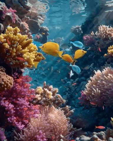
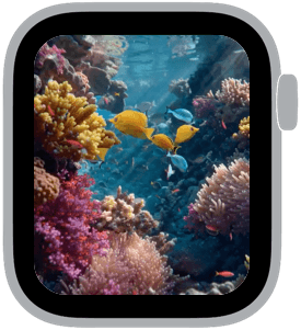
Fish City is a short, animated reef scene that drops you into a sunlit coral alley where tropical fish weave between colorful corals. The palette centers on seafoam blue and turquoise water, warm yellow and orange fish, and pops of magenta and pink coral; the combination reads beautifully on Apple Watch while remaining quietly lively. This face is for anyone who wants a quick, joyful moment of color on their wrist without sacrificing clarity for notifications.
Design inspiration and mood
Fish City draws on close-up reef photography and small saltwater ecosystems. Rather than a wide ocean panorama, the composition feels intimate: you’re close enough to appreciate coral texture, scale highlights, and the slight shimmer of water overhead. The mood is peaceful with a playful tilt — the loop is optimistic and short, meant to provide a tiny escape each time you glance down.
Layout and readability
The animation runs as a succinct loop chosen to preserve foreground detail in the Apple Watch crop. Primary action is placed off-center and away from the edges so complications and the rounded display corners don’t cut off key elements. Contrast is deliberate: cool background tones keep the scene calm while warm fish hues create readable focal points for complications and time text. Saturation is lively but restrained so small numbers and icons remain legible across lighting conditions.
Best use cases
Wear Fish City as an everyday face when you want color that lifts your mood without demanding attention. It’s well suited to casual and creative wardrobes, beach weekends, and anyone who spends time near water or enjoys nature motifs. The gentle, repeating motion makes it especially good for moments when you want movement that feels alive but not distracting during meetings or on public transit.
Personalization and settings
Keep complications simple and choose high-contrast text for maximum legibility over the animated reef. A single prominent complication in the center or lower quadrant keeps the interface clean; if you like color harmony, pick a monochrome complication tint that echoes the corals — soft magenta, warm yellow, or pale teal work nicely. For a minimalist look, use just one complication and move other metrics to the dock so the reef remains the star.
Technical notes
This face uses a short live clip optimized for the Apple Watch display so the motion loops smoothly and conserves battery compared with longer video. Framing is consistent across wrist sizes; the most important visual elements are kept well within the safe area to prevent cropping. The chosen loop length emphasizes natural, subtle movement rather than dramatic action so the animation feels organic on repeat.
Why people keep it
Fish City is chosen for its balance of color, texture, and practicality. It gives a moment of restoration—vivid corals and darting fish—without undermining watch functionality. The scene is decorative in a mature way: cheerful, restful, and reliably readable.
Try it on
If you enjoy lively natural color that still reads at a glance, add Fish City to your faces and fine-tune complication placement and color to make the reef feel personal. It’s an easy way to carry a small, restorative scene with you throughout the day.
in this collection


Discover all 4 watch faces in our app
download now
you may also like


vellum
time is what you make it