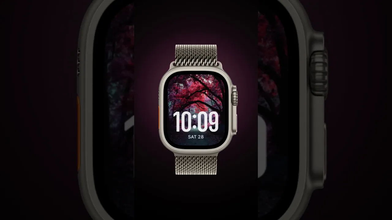
False Color

False Color opens as a small series of infrared landscapes and botanical close-ups that push color into surreal pinks and magenta against deep teal skies. This collection pairs dramatic foliage with restrained typography so the imagery reads clearly even at glance. You want False Color when you want your Apple Watch to feel like a miniature art print—bold, atmospheric, and a little otherworldly.
Design inspiration
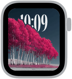
The images are inspired by classic infrared photography and film-era color shifts: luminous leaves rendered in unexpected pinks, clean negative space, and tall, elegant trunks rising from textured fields. Composition is simple and strong, favoring single focal elements—a lone oak, a slender birch stand, a maple branch—that give the face room to breathe. The resulting look blends landscape tradition with a contemporary, stylized palette.
Layout and readability
Each sample keeps the time display large and top-centered or top-aligned so numerals sit over generous sky or blurred negative space. That placement preserves legibility against the vivid foreground. Designers chose medium to large type sizes with rounded or classic letterforms to balance the organic shapes of leaves and branches. The 3D foreground depth used across samples lets the subject feel tactile while leaving the clock clear and unobstructed.
Mood and color
The mood reads dreamlike and slightly nostalgic. Hot pinks and magenta foliage create warmth and attention, while deep teal and navy skies provide cool contrast and a sense of calm. The combination produces a cinematic effect: energetic color in the foreground anchored by serene, moody backgrounds. This palette suits both daytime wear and low-light environments, making the face versatile across moods.
Best use cases
False Color is ideal for people who prefer expressive, art-forward watch faces rather than minimalist or utilitarian layouts. It complements casual and creative wardrobes, looks striking at social events, and works well for anyone who enjoys photographic detail without clutter. The clear time placement also makes it suitable for everyday use—appointments, quick checks, and short interactions—without sacrificing style.
Personalization tips
Choose a rounded or classic font depending on how formal you want the face to feel: rounded fonts read softer and more modern, while classic fonts add a refined, editorial touch. Use the medium time setting for balanced detail or the large time option when instant readability matters most. If your Apple Watch supports depth effects, enable them to emphasize the foreground and let the leaves or tree branches subtly overlap the numerals for a layered, tactile look.
Practical considerations
Because False Color relies on high-contrast subjects against darker skies, complications are best kept minimal or placed where they don’t interfere with the main image. Short text complications paired beneath the time maintain visual harmony. For activity or health data that you check frequently, select small, unobtrusive modules that sit at the bottom or corners.
Final note
False Color turns everyday glances at your wrist into small moments of surprise and beauty. The collection balances bold color with careful typography and layout choices, creating faces that feel curated and wearable. Try a sample with medium time and 3D depth first—then adjust font weight and complication placement to make it unmistakably yours.
in this collection



Discover all 8 watch faces in our app
download now
you may also like


vellum
time is what you make it