Espresso Hour

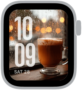
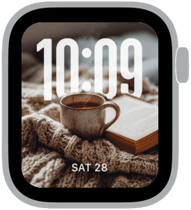
Espresso Hour presents a curated set of three Apple Watch faces that celebrate quiet café moments, warm brown palettes, and soft, amber highlights. The collection looks like an early evening at your favorite local coffee spot—steaming espresso, a pumpkin latte in a glass mug, and a cappuccino on a bistro table scattered with fallen leaves. You’ll want these faces if you like rich, tactile imagery that reads well behind bold, oversized time numerals.
Design inspiration
The imagery draws from café culture and late-afternoon light: varnished wood, textured ceramic cups, frothy crema, and window droplets catching city lights. Photographic depth is a central motif here—the foreground subjects are tactile and three-dimensional while backgrounds blur into warm bokeh. Fonts lean classic or rounded in some samples, with X-large and large time treatments to ensure clarity over complex imagery.
Layout and readability
Each face prioritizes readable time at a glance. Large and X-large time placements are used in left or top positions so the numerals sit cleanly over dark or softly blurred areas. Where the photo has strong highlights—like a lamp’s warm glow or a sunny patch on a table—the type is positioned to maximize contrast, usually in pale cream or off-white to keep legibility without feeling harsh. Small complications are kept minimal or centered beneath the time to preserve the picture’s composition.
Mood and color
The collection favors warm brown, cream, amber, and neutral beige with occasional orange accents from autumn leaves and pumpkin props. The overall mood is cozy, contemplative, and slightly cinematic—think late autumn afternoons, rainy windows, and the hush of a small café. Ambient light and shallow depth of field create a comforting intimacy that makes the watch feel like a small window into a quiet ritual.
Best use cases
Espresso Hour is ideal for anyone who wants a daily reminder of calm and craftsmanship: morning coffee routines, weekend strolls, or winding down in the evening. It’s especially well suited for people who prefer photographic faces over abstract graphics and need time that’s immediately legible during quick glances. The darker, moody samples also work well for nightstand mode and low-light environments where the warm highlights add character without being distracting.
Personalization and pairing
To personalize, choose the font and time size that matches your habits. Classic fonts with X-large time give a refined, editorial look, while rounded or modern styles feel more relaxed and contemporary. Pair the faces with warm-toned strap materials—leather in chestnut or dark brown, or a neutral beige band—to complete the tactile, café-inspired experience. For complications, favor simple readouts like date or a single activity metric to keep the composition uncluttered.
Practical notes
Because the photos use shallow depth of field and textured surfaces, expect subtle shifts in contrast across different Apple Watch sizes. The large time options are intentionally bold to maintain instant readability. If you often use multiple complications, choose the layouts where the time sits top-left or top-centered so the additional elements can sit beneath without covering foreground details.
Closing invitation
If you savor slow mornings and warm visuals, Espresso Hour makes your Apple Watch feel like a small, portable café—dependable, tactile, and quietly stylish. Try a few faces in the set to find the time style and placement that fits your routine and watch size best.
in this collection



Discover all 8 watch faces in our app
download now
you may also like



vellum
time is what you make it