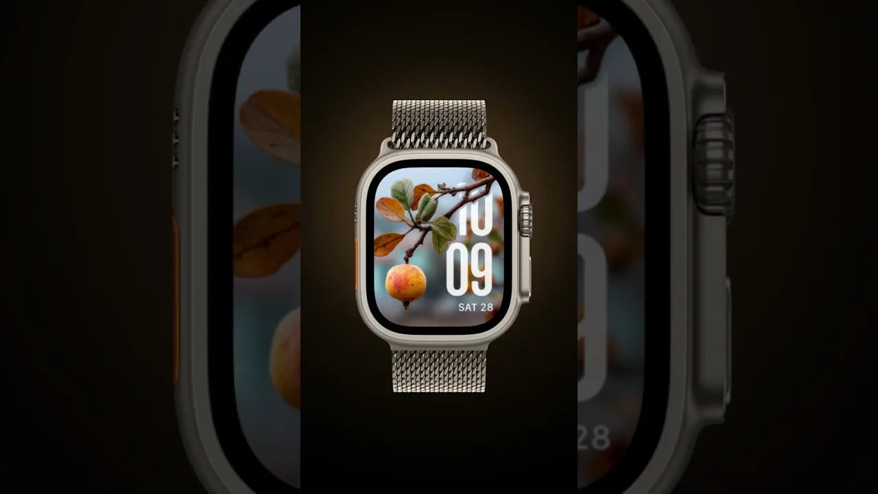
Cranberry Dusk

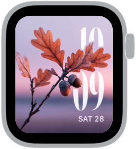
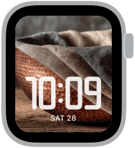
Cranberry Dusk is a small collection of Apple Watch faces that leans into autumnal still life: cranberry clusters, bronzed oak branches with acorns, and a curved copper bowl set against dusky light. The palette is low-key and sophisticated — deep cranberry red, muted mauve skies, warm brown and copper highlights, and soft beige textures — chosen so the time remains legible while the image adds seasonal atmosphere. You’d pick this set when you want a daily reminder of slow, tactile moments rather than loud or busy graphics.
Design inspiration and composition
These faces borrow from classic still-life photography and simple tabletop vignettes. Each sample uses a shallow depth of field to isolate a single motif — a trio of berries, a branch tipped with acorns, or the rim of a hammered copper bowl — which creates a natural focal point for the watch’s type. The images favor negative space and soft horizons, letting numerals in modern and serif styles sit crisply without competing with background detail.
Layout and readability
Time is prioritized with X-Large and Large type sizes, placed thoughtfully to preserve the subject. Right-placed X-Large numerals work well over sky-toned areas where contrast is highest; left placement pairs nicely with subjects on the right side of the frame. A rounded or classic font complements the organic shapes while remaining easy to read at a glance. The 3D foreground depth treatment provides subtle separation between the photographed subject and the watch’s time, maintaining legibility even in low light.
Mood and use cases
Cranberry Dusk is intentionally contemplative. It’s well suited to quiet mornings, autumn commutes, and evenings at home when you want your watch to feel like a crafted object rather than a digital badge. The collection reads as warm and slightly nostalgic — ideal for anyone who favors muted seasonal palettes and tactile textures over high-contrast, colorful faces.
Personalization and practical tips
For the cleanest look, choose the X-Large time option with a classic or modern type and right placement when the subject sits left of center. If you prefer step counts or complications, keep them minimal: one compact complication in a neutral color preserves the photograph’s calm. Use the 3D foreground depth when available to give the numerals a subtle lift from the image; this is especially useful on the berry and acorn compositions where foreground details are delicate.
Pairing and wardrobe
The palette plays well with neutral jackets, wool scarves, and copper-toned accessories. If you often wear warm browns or deep reds, these faces will harmonize with your outfit rather than clash. They also make an elegant match for leather straps in tan or dark brown and for metal bands with a warm finish.
Final note and call to action
Cranberry Dusk brings a quiet, seasonal sophistication to Apple Watch screens with imagery that feels handcrafted and restrained. Try each sample with different type placements to find the balance of image and information that suits your routine, and let the warm tones carry you through the shorter days of the season.
in this collection



Discover all 6 watch faces in our app
download now
you may also like


vellum
time is what you make it