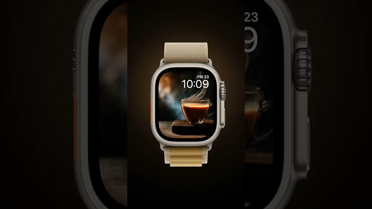
Copper Kettle

Copper Kettle is a small series of short live previews that capture the quiet warmth of copper teapots, steaming cups, and antique vessels. These Apple Watch samples show rich, moody textures and a restrained palette of warm brown, copper, and soft sepia highlights so your wrist feels like a brief moment of calm during a busy day. Each 2.4 second animated preview emphasizes subtle motion — a curl of steam, the shimmer on patina — while keeping the composition simple and readable on a small circular display.
Design inspiration and mood
The collection draws on classic still-life painting and old-world kitchen photography. Lighting is directional and low-key, creating deep shadows and soft highlights that make metal and glass sing. The overall mood is intimate and contemplative: imagine early morning ritual, a slow pour, or the satisfying hiss of a kettle coming off the stove. Colors center on warm brown, copper, golden brass, and neutral beige with occasional darker charcoal backgrounds to let the subject glow.
Layout and readability on Apple Watch
Because these are intended for Apple Watch, compositions are tight and centered so the subject remains clear at glance size. Negative space is used deliberately — darker areas frame the kettle or cup and keep complications and time readouts legible. The short looped motion is framed to start and end gracefully, avoiding sudden jumps that distract when you raise your wrist. Choose a face layout with a minimal complication setup to preserve the simple silhouette of the cup or teapot.
Best use cases
Copper Kettle is ideal for anyone who wants a calming, tactile feel on their wrist: morning people who want a little ritual reminder, designers who appreciate classic materials, and anyone who prefers subdued, non-distracting motion. These samples work particularly well with modular or center-focused faces where the animated subject is the visual anchor. They also make a refined pairing with leather bands, warm metal finishes, and autumn or colder-season wardrobes.
Personalization tips
For maximum effect pick a watch face color and complication style that echo the palette: warm gray or dark brown for backgrounds, simple white or cream text for contrast. Reduce complications to a single essential item, such as activity rings or a small date, so the animated copper subject remains the focal point. If you want more drama, use the version with stronger rim lighting; choose the subtler cup composition when you need a calmer, less reflective surface.
Technical notes and preview behavior
Each sample is a 2.4 second looped live preview crafted to behave smoothly when raised and lowered. Motion is gentle and intentional: rising steam, faint surface ripples, and the slow catch of light on curved metal. These short, muted loops avoid bright flashes and keep battery impact low. When setting the face, preview it on your wrist first to confirm that the animation start aligns with your raise gesture.
Closing and call to action
If you’re drawn to tactile materials and tranquil moments, Copper Kettle adds a quiet, polished presence to your Apple Watch. Try the different samples to find the one that matches your daily rhythm, then save it as your active face to carry a small, warm pause with you throughout the day.
in this collection


Discover all 4 watch faces in our app
download now
you may also like


vellum
time is what you make it