Colorwave
Colorwave is a curated set of Apple Watch faces defined by flowing pastel ribbons, translucent layers, and a soft, iridescent palette that feels like silk in motion. These designs pair broad swaths of seafoam green, lavender, peach, soft yellow and bubblegum pink with subtle highlights and diffuse light to create a calming backdrop that still reads clearly at a glance. You’ll want this collection for everyday wear when you want your wrist to feel both modern and gentle—perfect for work, travel, or quiet weekends.
Design inspiration
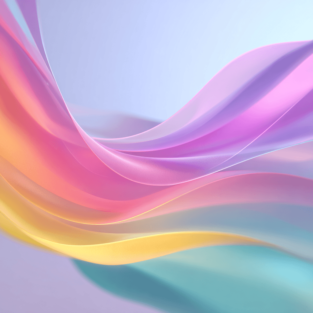
The Colorwave aesthetic comes from fabric, glass, and liquid light: think blown silk, soap-film color shifts, and ribbons suspended in water. Each sample uses sweeping curves and layered translucency to suggest depth without visual clutter. The result is decorative but restrained, with motion cues that lead the eye to the center where the time sits.
Layout and readability
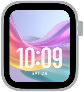
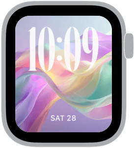
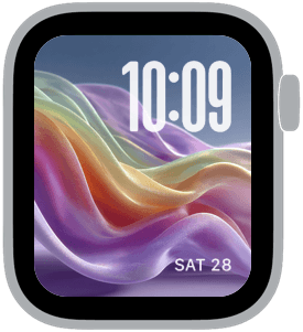
These faces were designed with large time treatments in mind. Several samples favor big, bold numerals placed either at the bottom or the top of the display, while others use classic serif numerals for a slightly more formal look. Contrasting the soft background, the type remains crisp and legible: white or off-white time text cuts through the pastel gradients for immediate readability. When choosing complications, prefer minimal, single-line options so the elegant ribbons remain visible and the dial doesn’t feel crowded.
Mood and personality
Colorwave reads as calm, optimistic, and refined. The palette conveys warmth without being loud, leaning into a feel-good, sophisticated charm. It’s an uplifting choice for mornings when you need a gentle nudge, and it keeps a relaxed, polished presence during meetings or social time. The soft textures bring a tactile quality to the digital surface that feels personal rather than purely decorative.
Best use cases
This collection shines for people who want a stylish daily face that doesn’t sacrifice clarity. It’s ideal for creatives, people who enjoy color but prefer subtlety, and anyone who likes their watch to function as a wearable accent. Use the larger-time layouts for quick time checks while commuting or exercising. The rounded and modern numeral styles work well for casual settings; the classic serif variant makes Colorwave suitable for dressier occasions.
Personalization tips
Select the sample that complements your wardrobe or mood—cooler seafoam and mint options pair well with neutral and navy outfits, while warm peach and soft yellow tones look great with earth tones and pastels. Experiment with top versus bottom time placement: top placement emphasizes the background composition, while bottom placement anchors the face and leaves the central ribbons more visible. Keep complications to a minimum or choose monochrome icons to maintain the collection’s airy character.
Finishing notes
Colorwave offers sixteen thoughtful assets so you can rotate between subtle variations or settle on one look that feels like yours. Each face balances artistry with utility, giving you time-first clarity while dressing the watch in a distinctive, polished palette.
Try one now and let the soft gradients transform routine glances into a small daily pleasure.
in this collection


Discover all 8 watch faces in our app
download now
you may also like


vellum
time is what you make it