Chromatic Garden
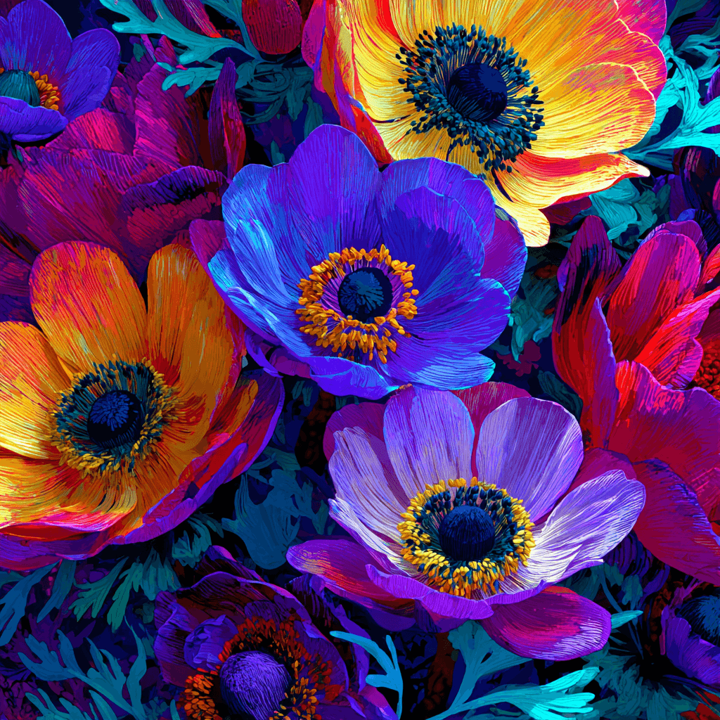
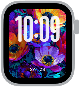
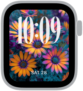
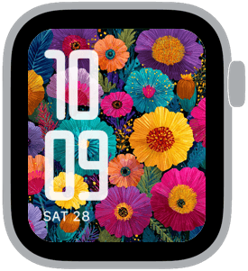
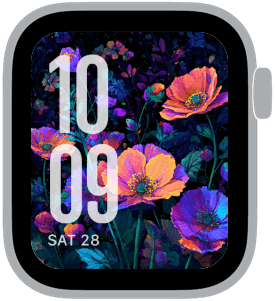
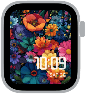
Chromatic Garden is a celebration of color and bloom: oversized petals rendered in jewel tones, dense botanical textures, and compositions built to make the time read like a centerpiece. On Apple Watch these designs pair large, top-placed numerals or X-large left-aligned time with lush floral backdrops so your glance becomes an aesthetic moment rather than a quick check. The palette leans into magenta, teal, deep blue, sunset orange and rich purple—colors that pop against dark foliage and keep the numbers legible without sacrificing impact.
Design inspiration and craft
The visuals in Chromatic Garden draw from botanical illustration and modern poster art, mixing painterly strokes with clean negative space where the time appears. Each sample treats flowers as the primary graphic element: layered blossoms overlap and recede to create depth while selective desaturation and shadowing ensure the digital numerals sit comfortably on the surface. Type choices in the samples range from classic condensed to rounded display faces, chosen to balance presence with clarity when placed over complex patterns.
Layout and readability
Because the collection prioritizes large time displays, compositions are intentionally arranged so the time sits in a clear area—top, left, or right—while still feeling integrated into the scene. Designers have left subtle breathing room around numerals, using darker perimeters and gentle vignettes to increase contrast. For smaller complications or date indicators, the floral backgrounds are softened beneath those elements rather than obscuring them, which keeps readability high during quick glances.
Mood and personality
Chromatic Garden feels exuberant and confident. The saturated blooms deliver joy and energy, while the darker supporting greens and blues add depth and a touch of sophistication. Wearers who want to express a bold creative mood, brighten a workday with vivid color, or add a luxe floral accent to evening attire will find this collection especially satisfying. It reads as both playful and refined—strong enough for a statement but detailed enough to reward a closer look.
Best use cases
This collection suits anyone who treats their watch as a style anchor: designers, creatives, or anyone who prefers a highly visual dial. The larger time treatments are ideal for quick readability during meetings or workouts, while the rich palettes make evening and weekend looks feel intentional. These faces also work well with brighter band choices—think coral, deep teal, or matte purple—to create an integrated outfit. Because the art is dense and colorful, it’s less suited to ultra-minimalist tastes but perfect for those who like expressive, wearable art.
Personalization tips
Choose a font weight that complements your preferred look: heavier, condensed numerals for maximum presence, or rounded display fonts for a friendlier feel. If you rely on complications, pick simpler ones with high-contrast backgrounds so they remain readable against the flowers. Adjust the brightness or dial vignette to push the background deeper and make the time pop if you often glance at your watch outdoors.
Chromatic Garden delivers a curated set of floral faces designed for visual richness without sacrificing practical legibility. Each piece is meant to be both functional and decorative—an artful way to keep time on your wrist. Try a couple of variations to see which placement and type style fit your daily rhythm, then lock in the one that feels like your go-to statement.
Experience the collection and let your watch become a small, vivid garden you check all day.
in this collection
Discover all 8 watch faces in our app
download now
you may also like


vellum
time is what you make it