Afterglow

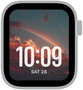
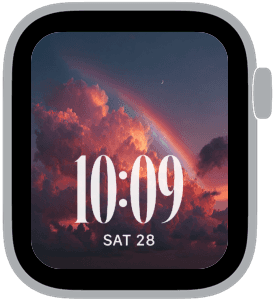
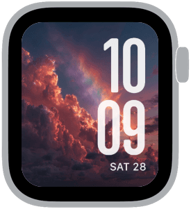
Afterglow presents a small series of dramatic sunset skies with a soft rainbow and luminous clouds, rendered in warm magenta, peach, dusky purple and deep blue. These samples lean into a cinematic afterglow palette so your Apple Watch looks like a window into the sky at golden hour — vivid without being fussy, and balanced so the time remains the visual focus.
Design inspiration and intent
Afterglow draws from storm-clearing sunsets and the natural drama of backlit clouds. The reference imagery emphasizes texture in the clouds and a single sweeping rainbow to add compositional interest. The goal is to pair natural spectacle with minimal, readable typography so the display feels elevated and personal rather than decorative.
Layout and readability
Each sample was composed with large, high-contrast numerals in mind. Times are placed predominantly at the bottom or slightly to the right to avoid obscuring the most dramatic cloud highlights and the rainbow arc. The palette includes deep blues and dusky purples in the shadows and warm peach and magenta in the highlights, which ensures white or off-white time digits remain legible across tonal shifts.
Mood and atmosphere
This collection leans romantic and serene with a hint of drama — the kind of imagery that calms yet feels emotionally charged. The afterglow colors create warmth on-screen while the rainbow introduces a hopeful, ephemeral quality. Use these faces when you want your watch to read like a small, cinematic scene rather than a flat background.
Best use cases
Afterglow works beautifully for evening wear, date nights, commuting at dusk, or anytime you prefer a softer, mood-driven look. The strong contrast options make it equally suited for daytime visibility when the watch is glanced at quickly. These faces are particularly effective for people who favor bold time typography paired with atmospheric imagery.
Personalization tips
Choose a modern or classic large-time style depending on whether you want a contemporary or vintage cadence. If you prefer minimal clutter, lean into the variants where the time sits at the bottom; for a more dynamic composition, choose the right-placed, extra-large time option that interacts with the rainbow arc. Adjust complication choices to keep essential data visible without covering key sky details.
Technical considerations
The imagery is framed to allow for safe zones around the screen edge and crown, so complications and notifications integrate cleanly. The color balance preserves contrast with light numerals while keeping shadow detail in the clouds. If you change the watch’s face color or complications, preview the time placement to ensure it doesn't hide the rainbow's focal point.
Closing note
Afterglow turns ordinary moments into something quietly cinematic on your Apple Watch. The combination of sunset tones, wispy clouds, and a gentle rainbow gives each quick glance a small, uplifting pause. Try the different time placements to find the composition that feels most like your evening sky.
in this collection


Discover all 8 watch faces in our app
download now
you may also like


vellum
time is what you make it